Case Study
Clawest
A shoppable site that explains Clawest’s AI water analysis and helps get clean drinking water to remote regions of Africa.
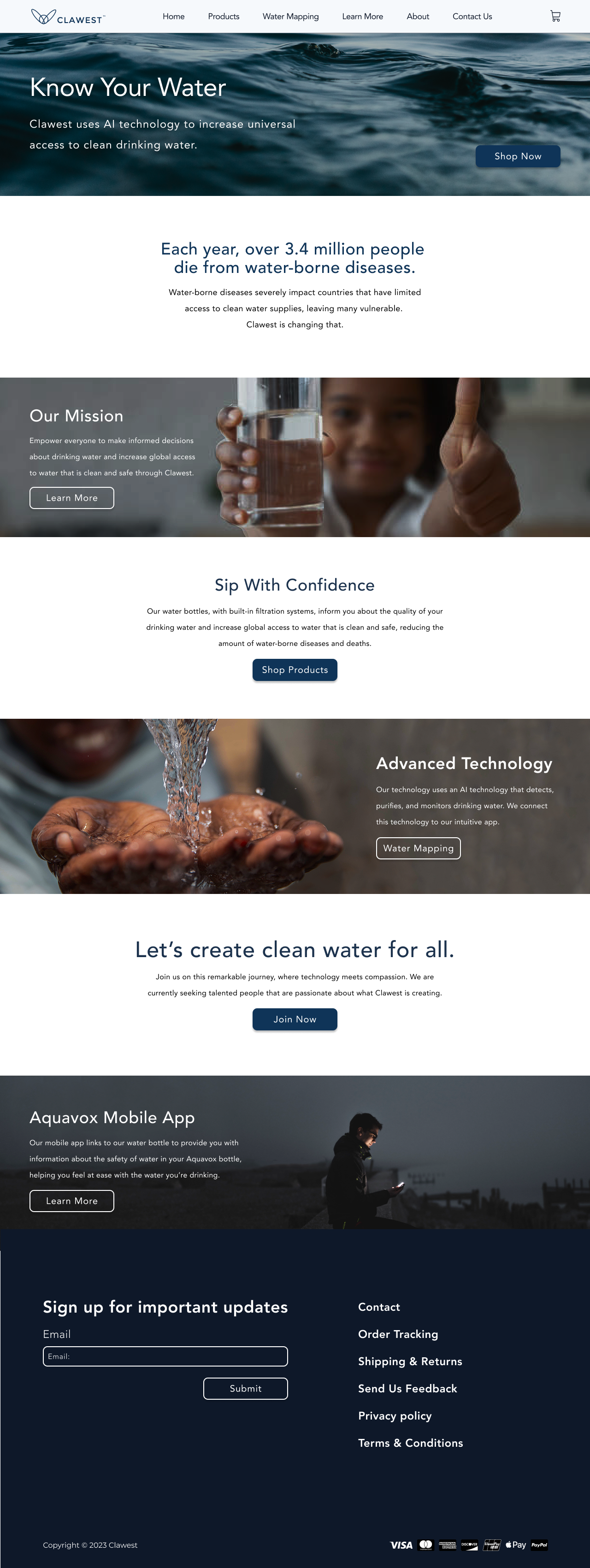
Scroll inside the screen to explore the full page
Clawest sells water bottles with AI toxin filtration, paired with an app that monitors water cleanliness in real time. The founder had a strong product story, but the existing site was hard to use and wasn’t set up to sell. We redesigned it so the mission, the technology, and the bottles were easy to understand — and easy to buy.
The Problem
The existing site was mostly informational. It didn’t follow common e-commerce patterns, and it left the obvious questions unanswered: how the bottle works, how to buy one, and how to maintain it.
The Solution
We redesigned the site to tell the mission clearly, explain the technology in plain language, and put the bottles front and center in a working shop.
- Tools
- Figma
- FigJam
- Zoom
- Loom
- Slack
- Google Docs
- Process
- Discovery
- Ideation
- Design
- Dev Handoff
- Reflection
- My Role
- UX/UI Designer
- Researcher
- Team of 5
- Timeline
- 12 weeks
Step 1 of 5
Discovery
Kick Off
To start, the team met on Zoom to compare notes on the existing site, the project scope, and what each of us could take on.
Client Questions
We asked the client for more detail on the bottles so we could design for the right audience. We also flagged accessibility issues with the logo and name, and suggested contrast changes. Key questions and answers:
- QWho is your target audience, and where are they located?
- AMy target audience is people in Africa without safe water.
- QIs the website just for information, or will people be able to buy the Aquavox water bottle directly?
- AYes, I plan to sell the bottles on the site once they're ready.
- QCan we change the blue in the logo? It sometimes looks purple, and a pure blue would fit well for a clean water website.
- AYes, feel free to adjust the logo.
Heuristic Evaluation
Our team gathered notes on usability issues from his current website and compiled them into a report. The main Nielsen Heuristic we found violated was:
- #8 Aesthetic and Minimalist Design — spacing was inconsistent, and images were blurry.
Step 2 of 5
Ideation
User Stories
At the start of the project, the client shared user stories that clarified the vision for the new site. They included:
- As a user, I want to learn how the water bottle works so that I understand what I'm buying.
- As a user, I want to purchase the water bottle directly from the site so that I can own one.
- As a user, I want to see water quality data by location so that I can trust the product.
- As a user, I want to understand the company's mission so that I feel connected to the cause.
- As a user, I want to contact the company so that I can ask questions before buying.
User Flows
To better visualize how the user would interact with the website, we created user flows and chose an area to work with. I assisted in designs for all user flows and thoroughly enjoyed ideating for the home page and water mapping page.
Inspiration
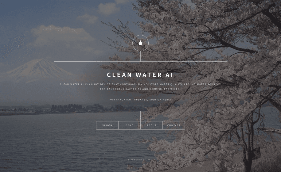
We looked at competitors like Larq, Smart Water, and Clean Water AI. Each had strengths we could learn from and gaps we wanted to avoid.
- Strength — an intuitive, easy-to-understand home page with a clear call to action.
- Weakness — small text and a lack of information about the product itself.
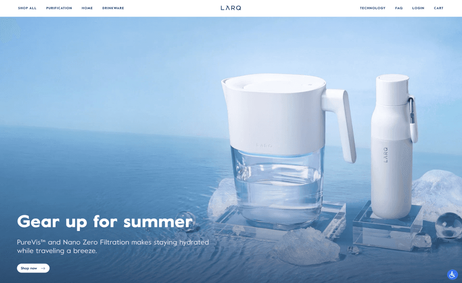
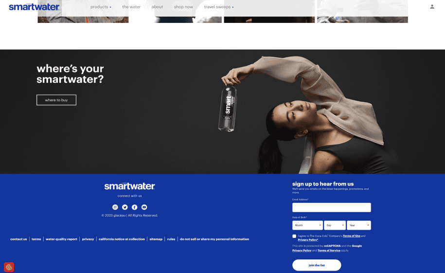
Clean Water A.I.
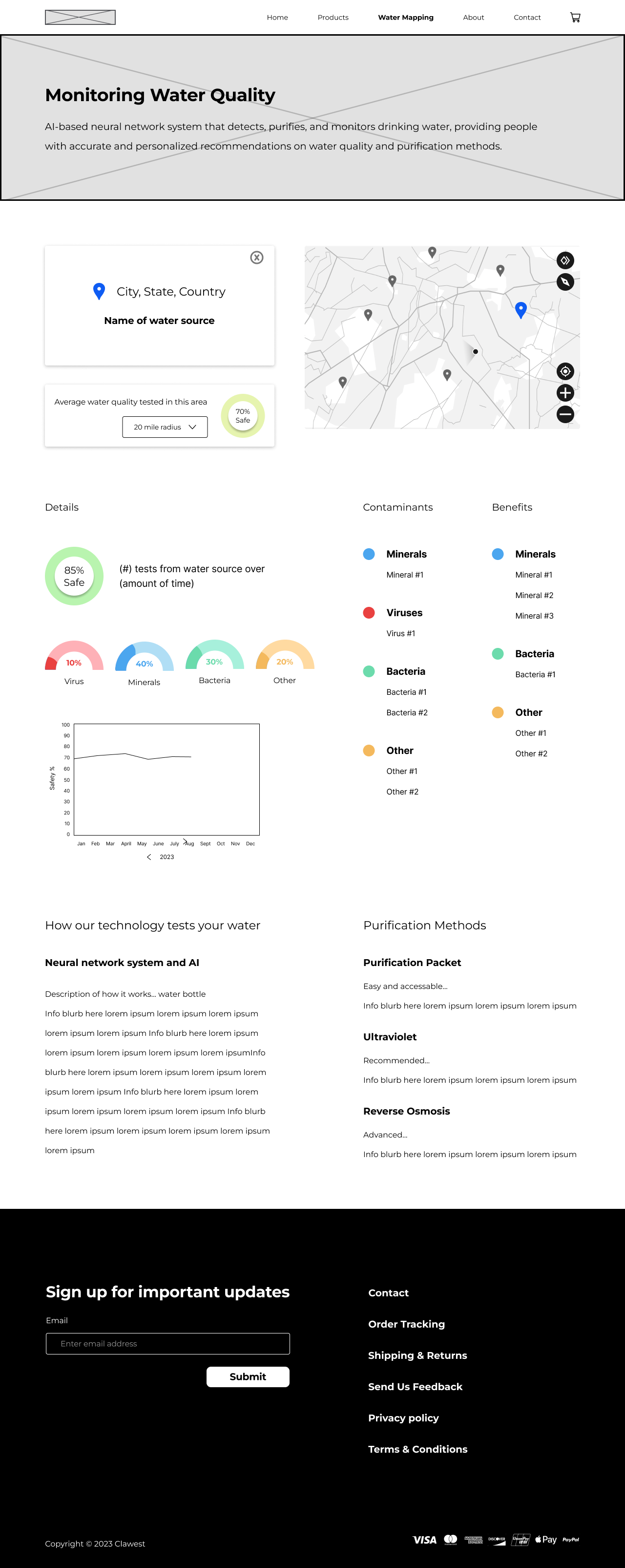
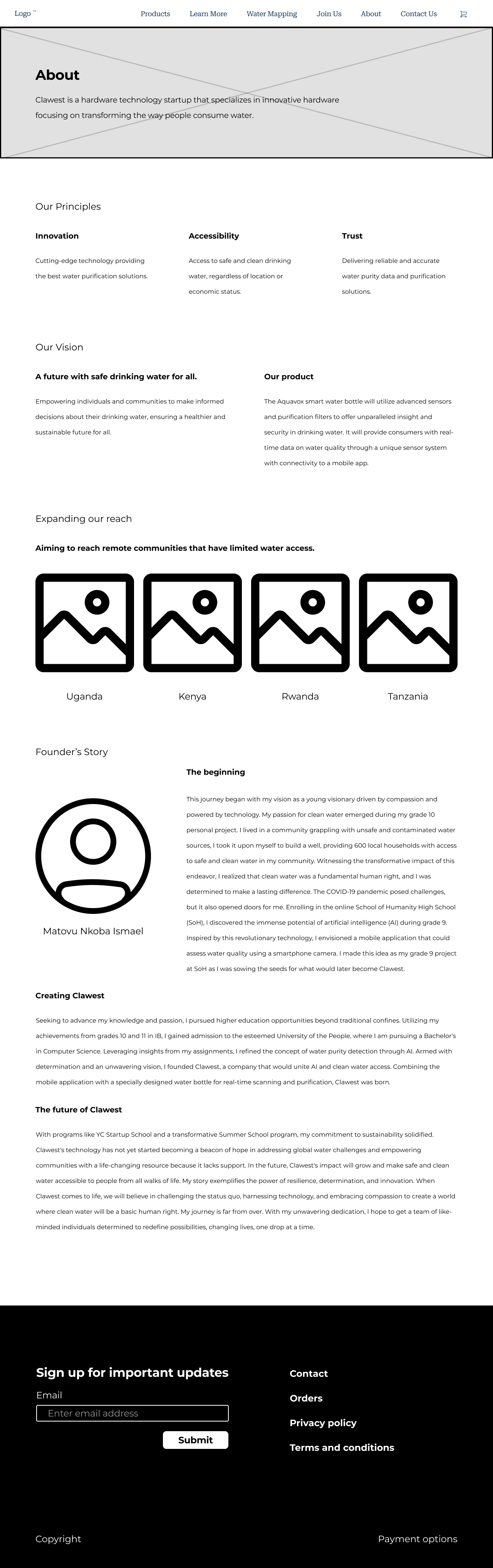
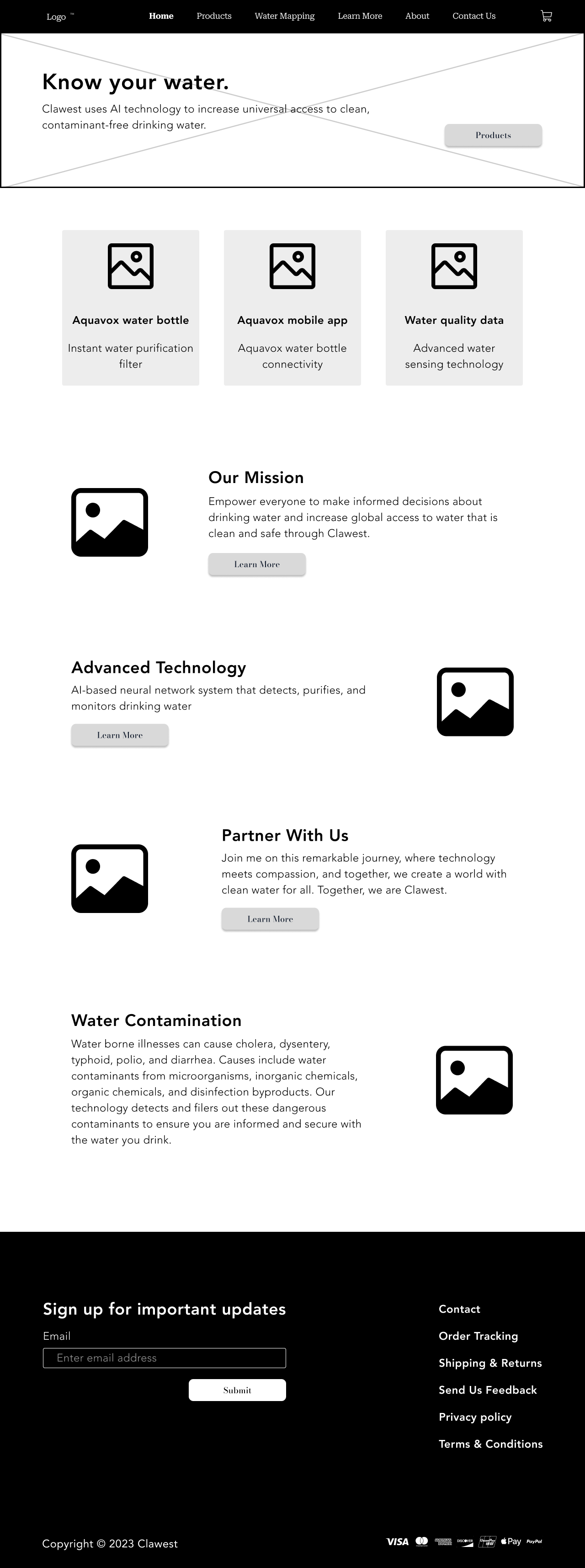
Lo-Fi Wireframes
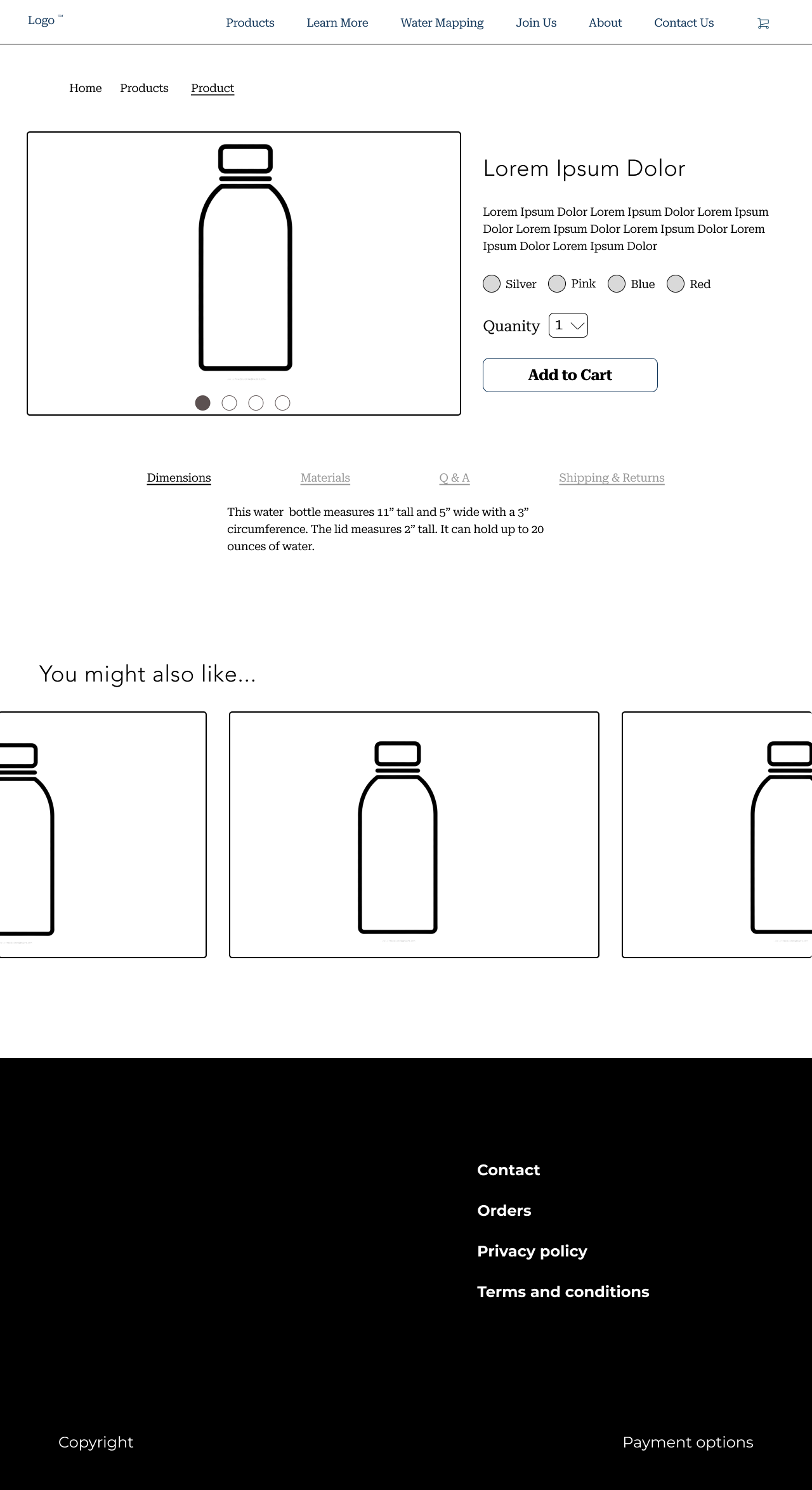
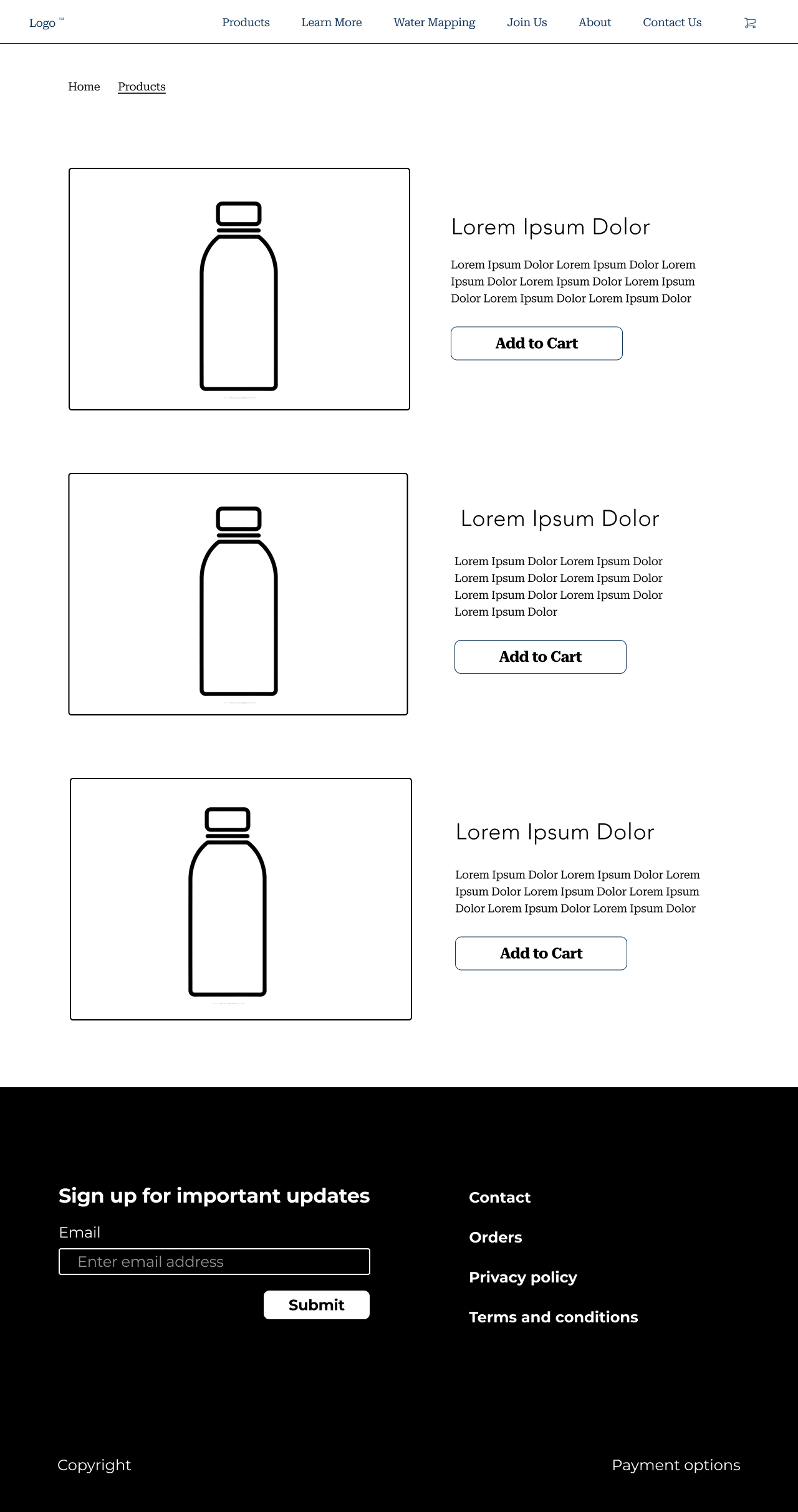
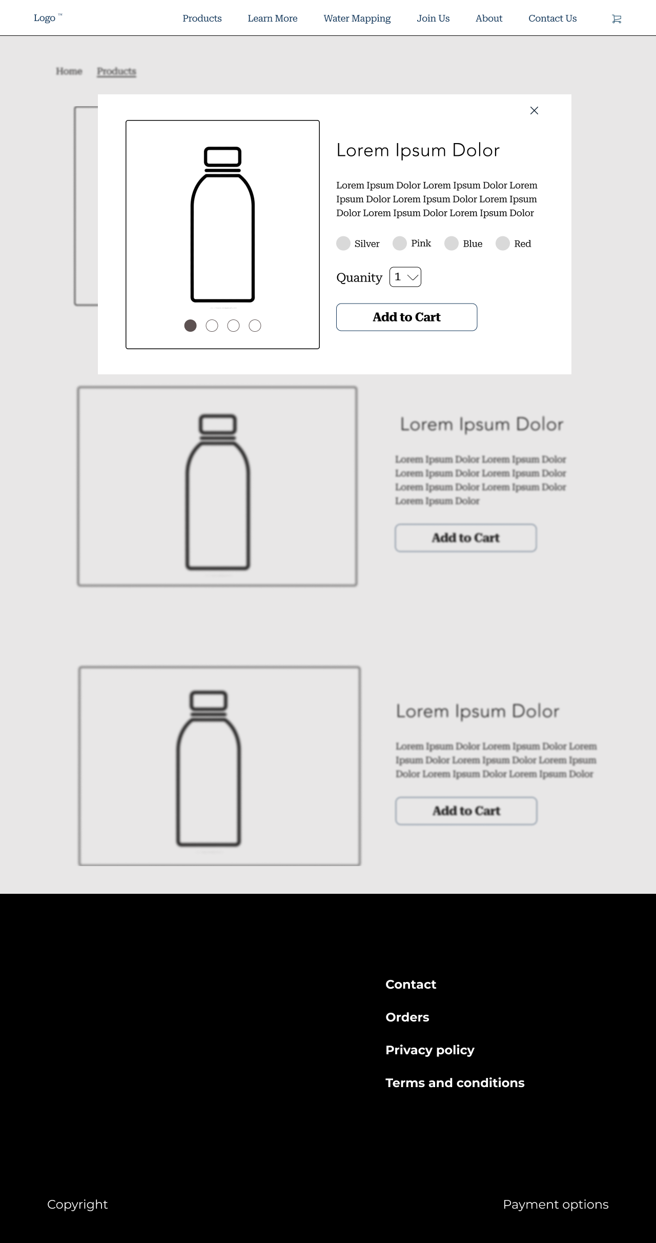
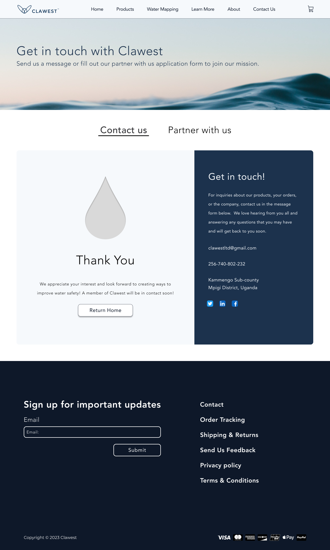
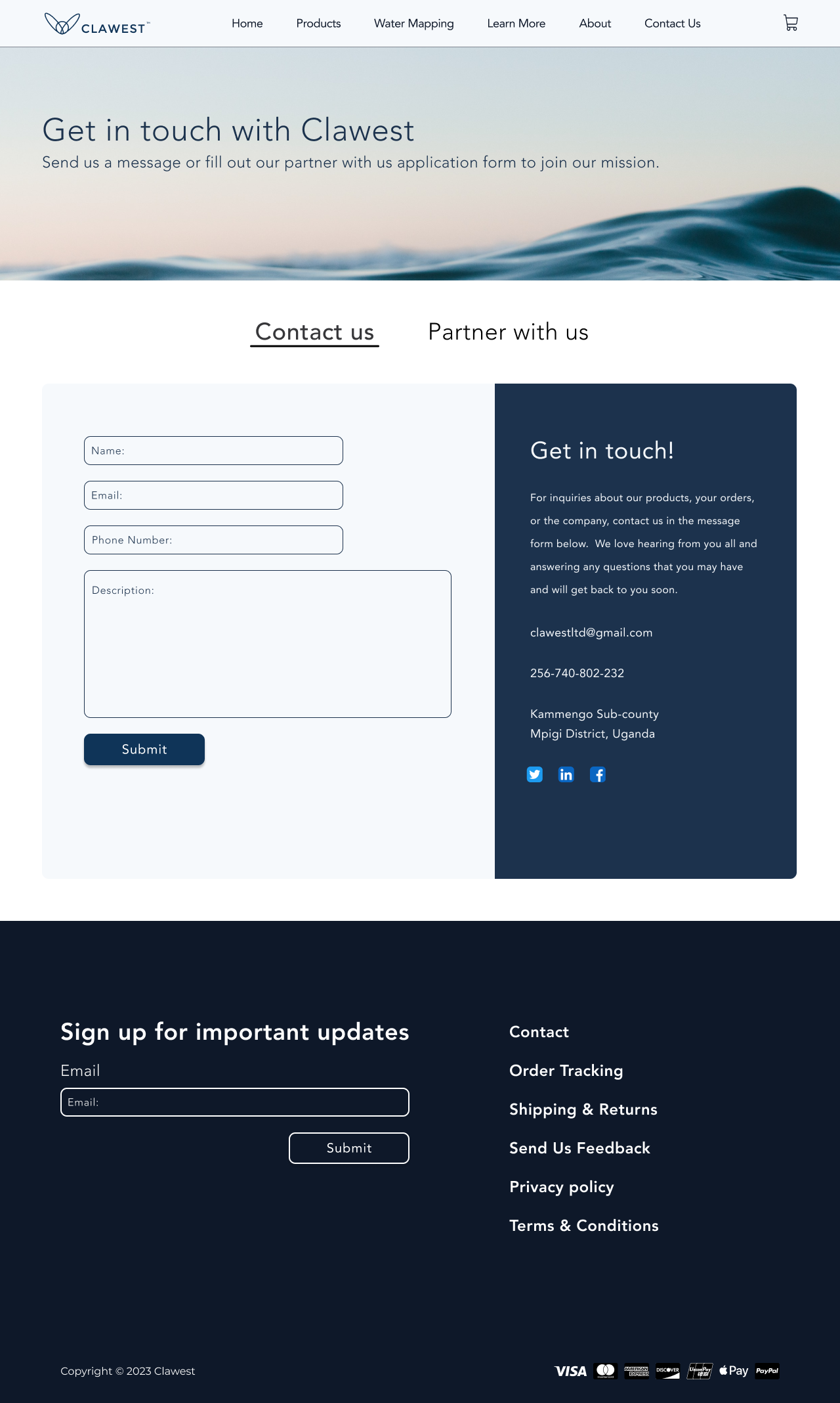
To further ideate we created lo-fi wireframes. While I helped with all areas, I prioritized the water mapping page, product page, and contact page.
Color Exploration
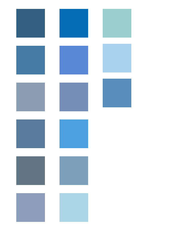
We explored blues that could carry a clean-water brand without feeling generic or hard to read.
UI Iterations
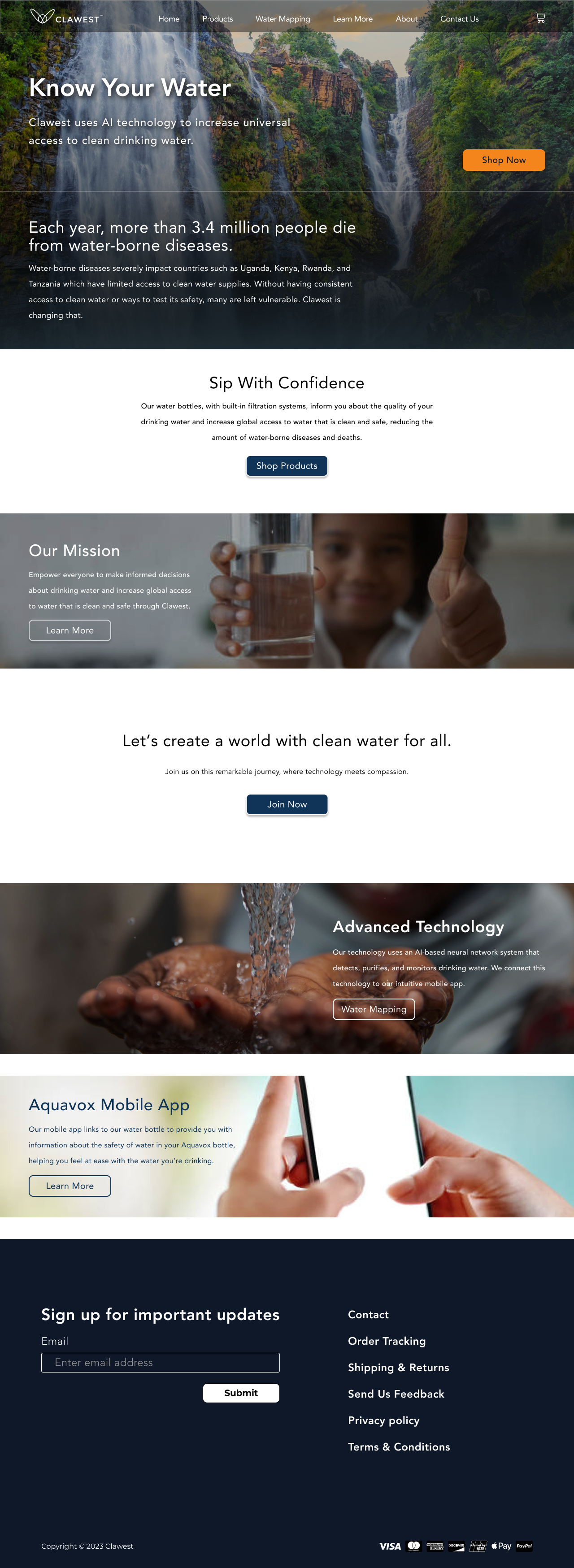
This was my favorite step. We designed three home-page directions for the client. I took a chance on a darker, photography-led take that sat outside the colors we’d been using.
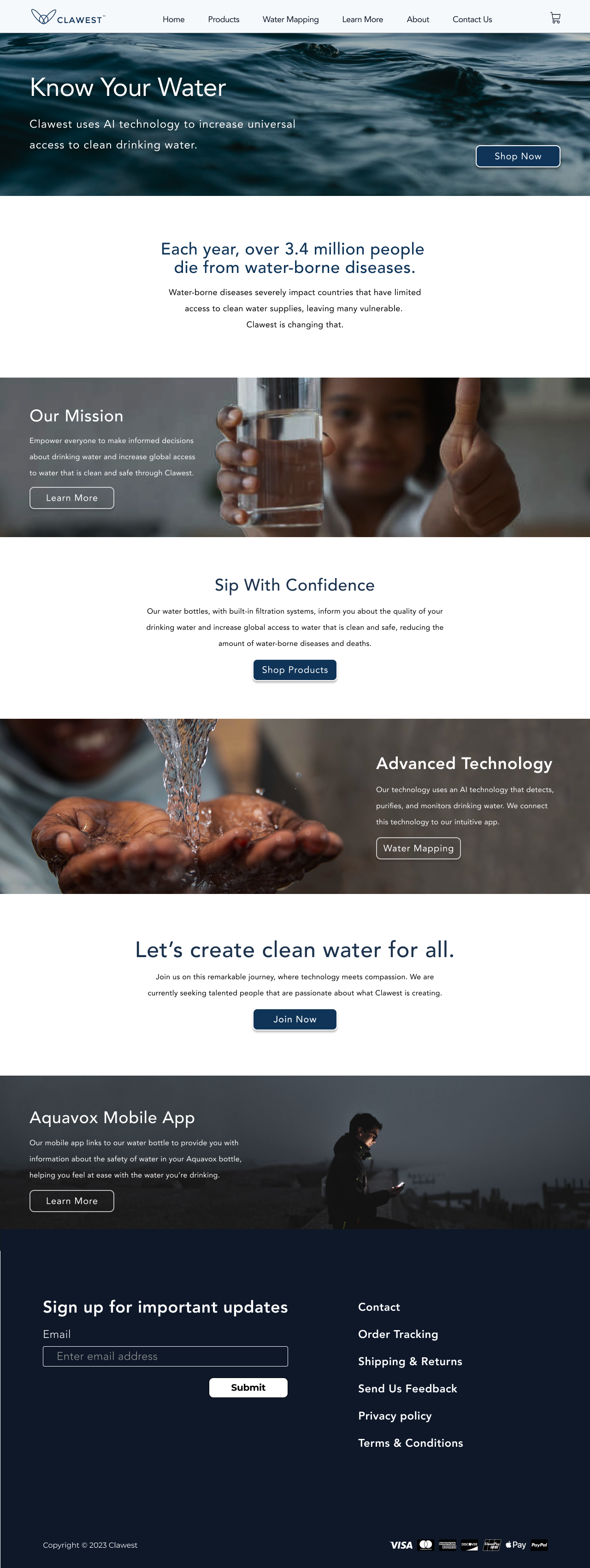
Client's Choice
My direction didn’t make the cut. The client chose a teammate’s cleaner, more on-brand home page — and it was the right call. Consistency beat a bolder one-off.
Step 3 of 5
Design
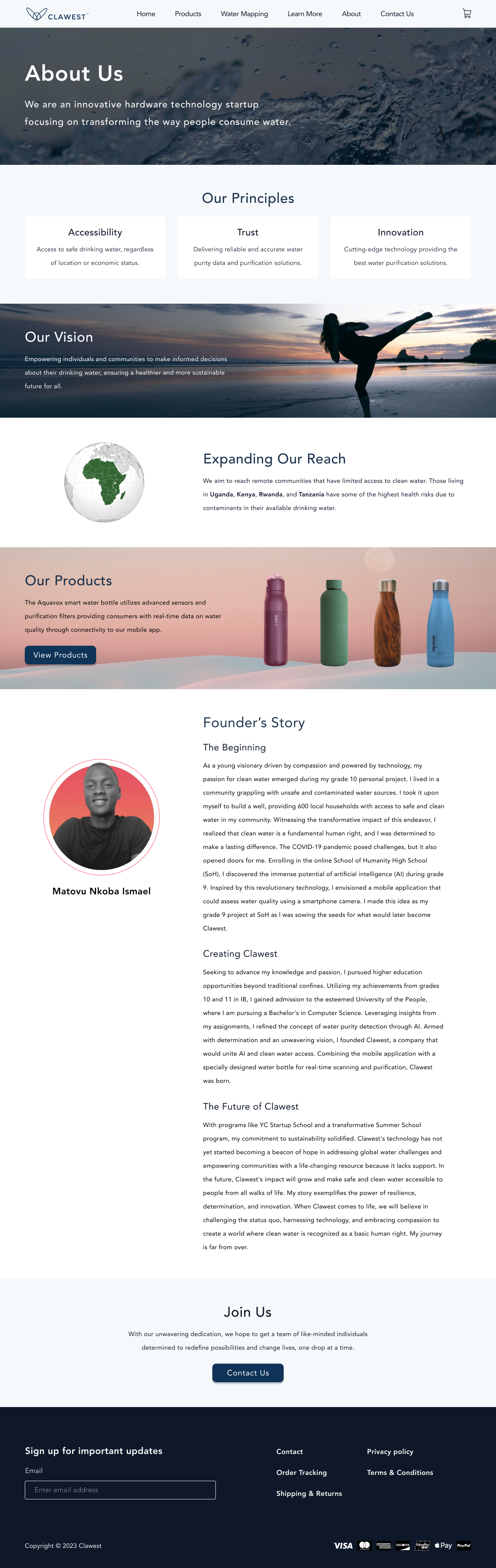
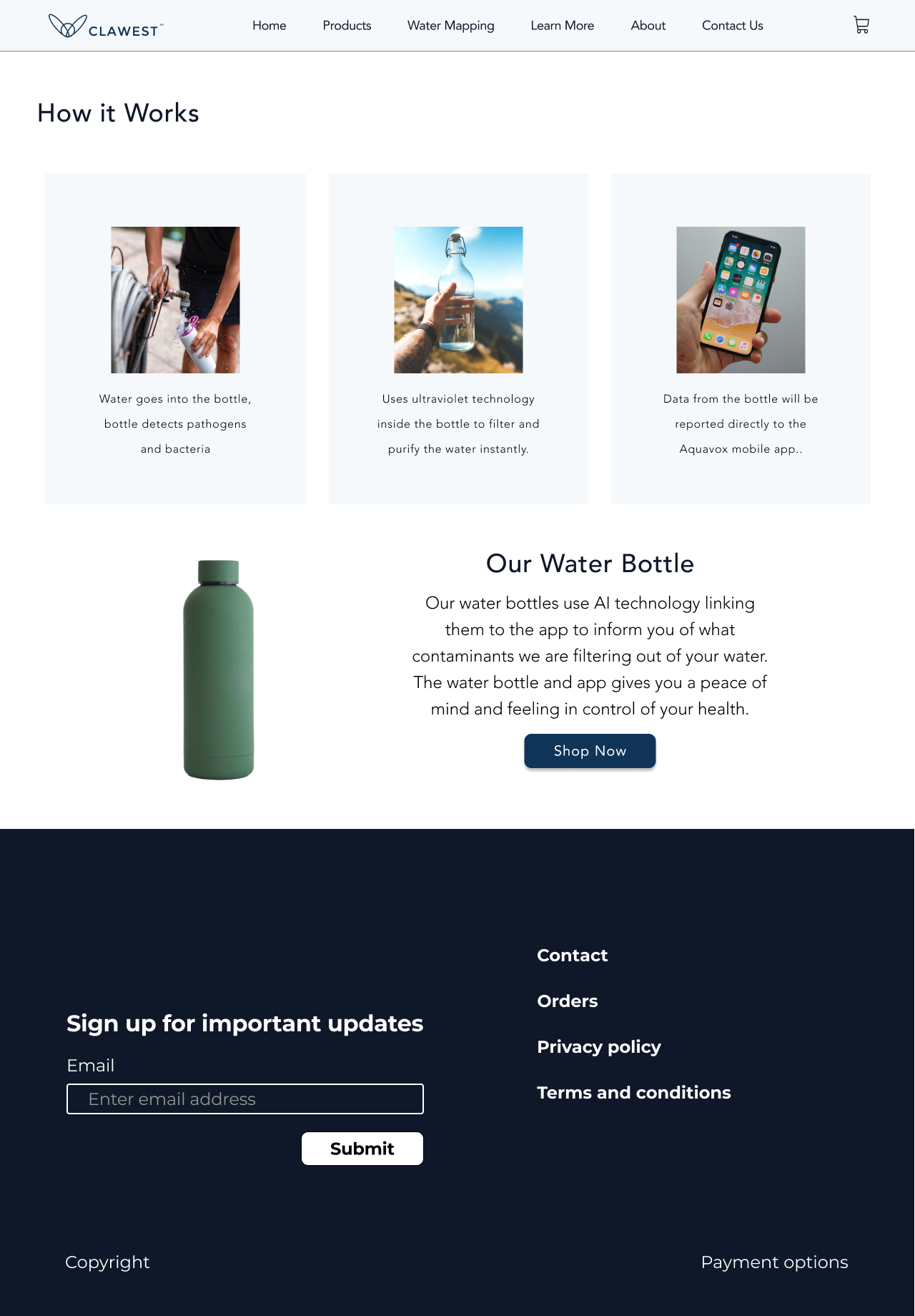
Hi-Fi Wireframes
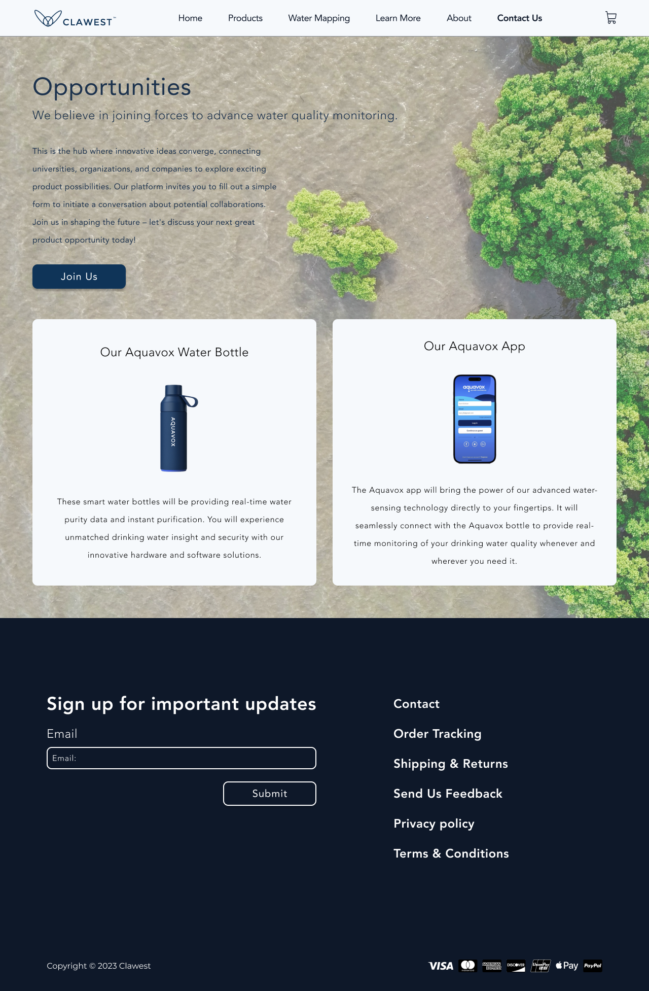
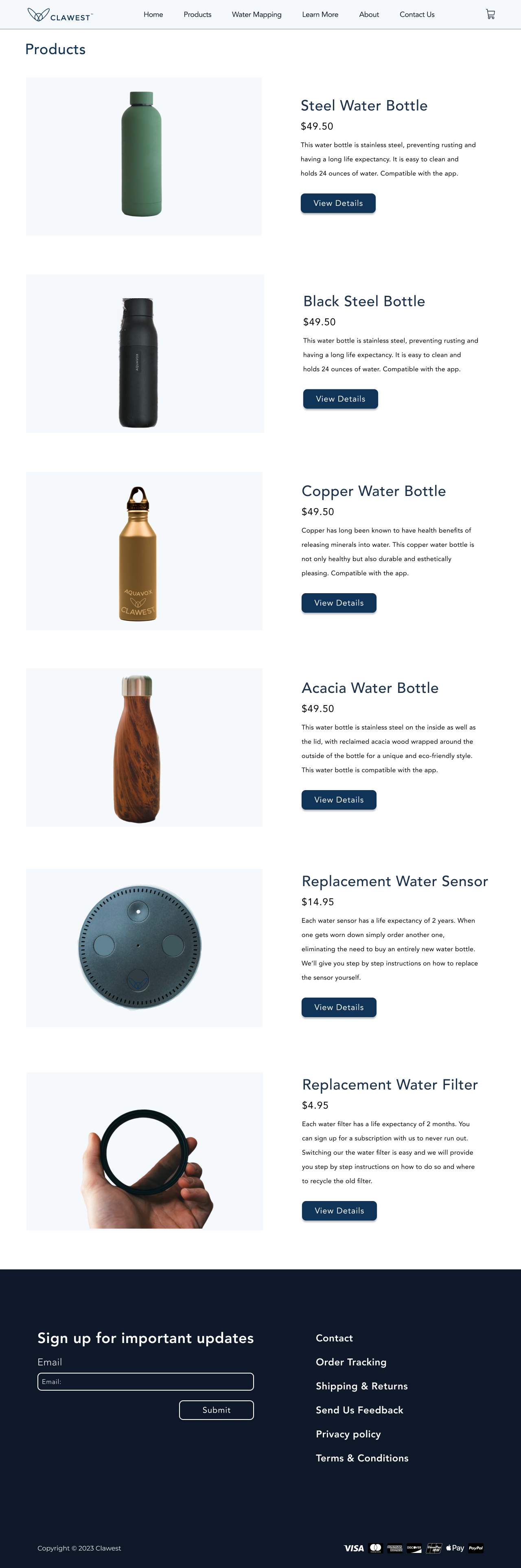
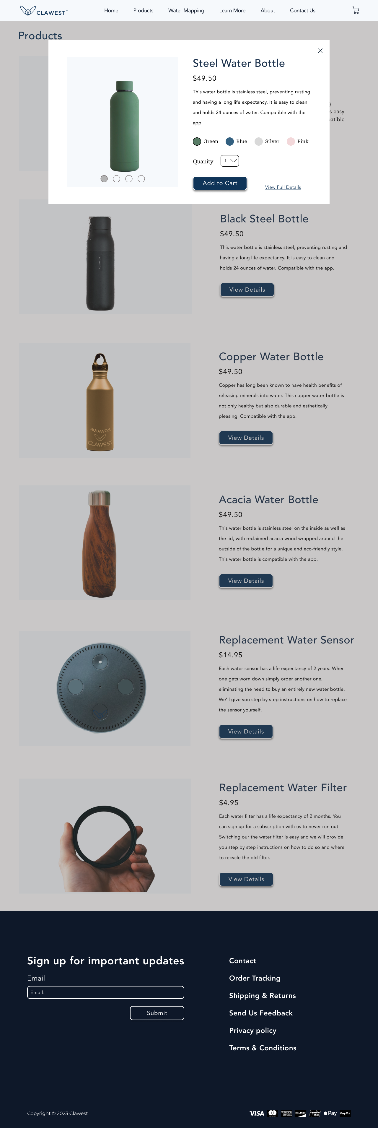
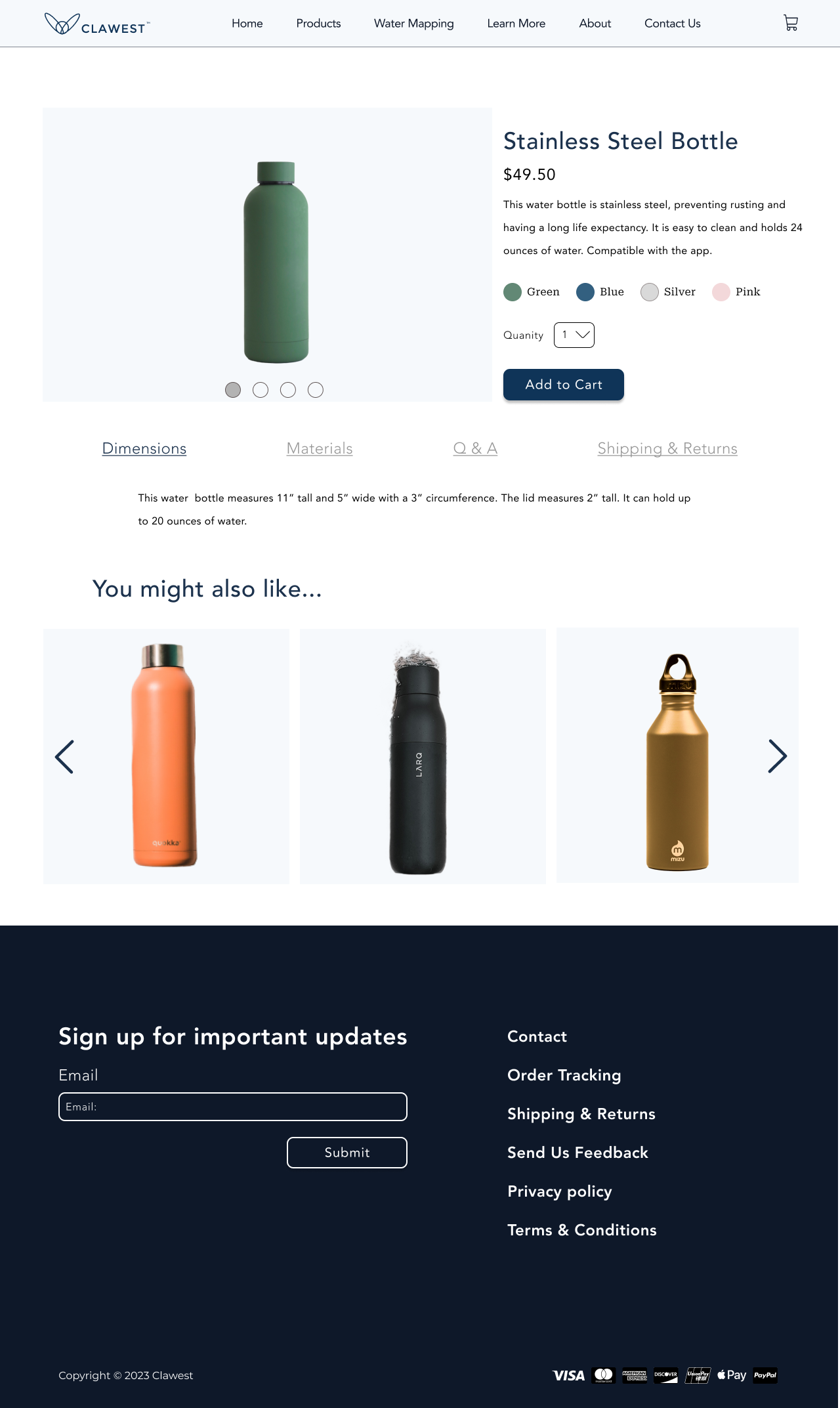
After the chosen UI and styles were locked, we built the final website wireframes — the most rewarding part of the process, watching the product come together.
Water Mapping Page
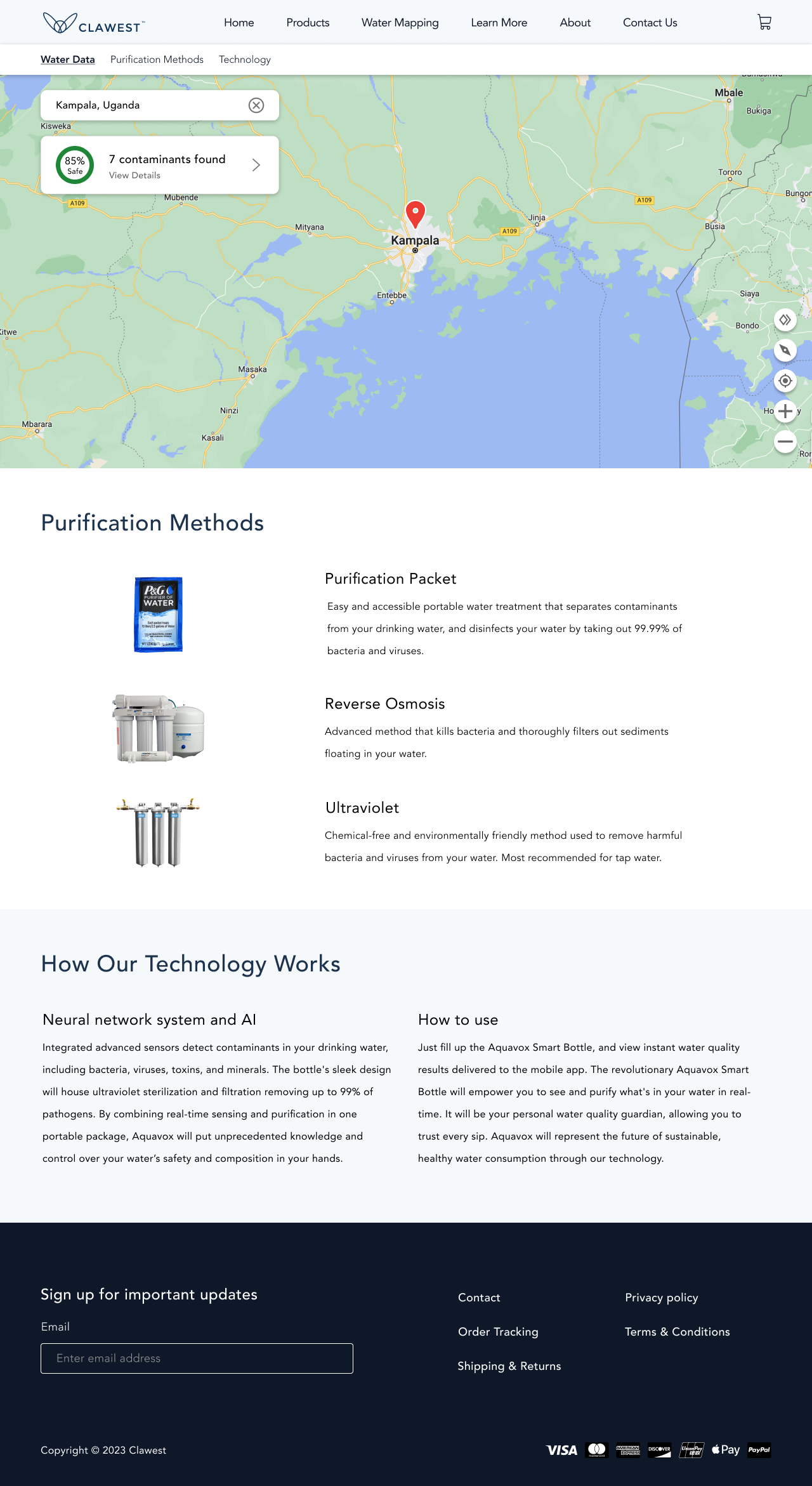
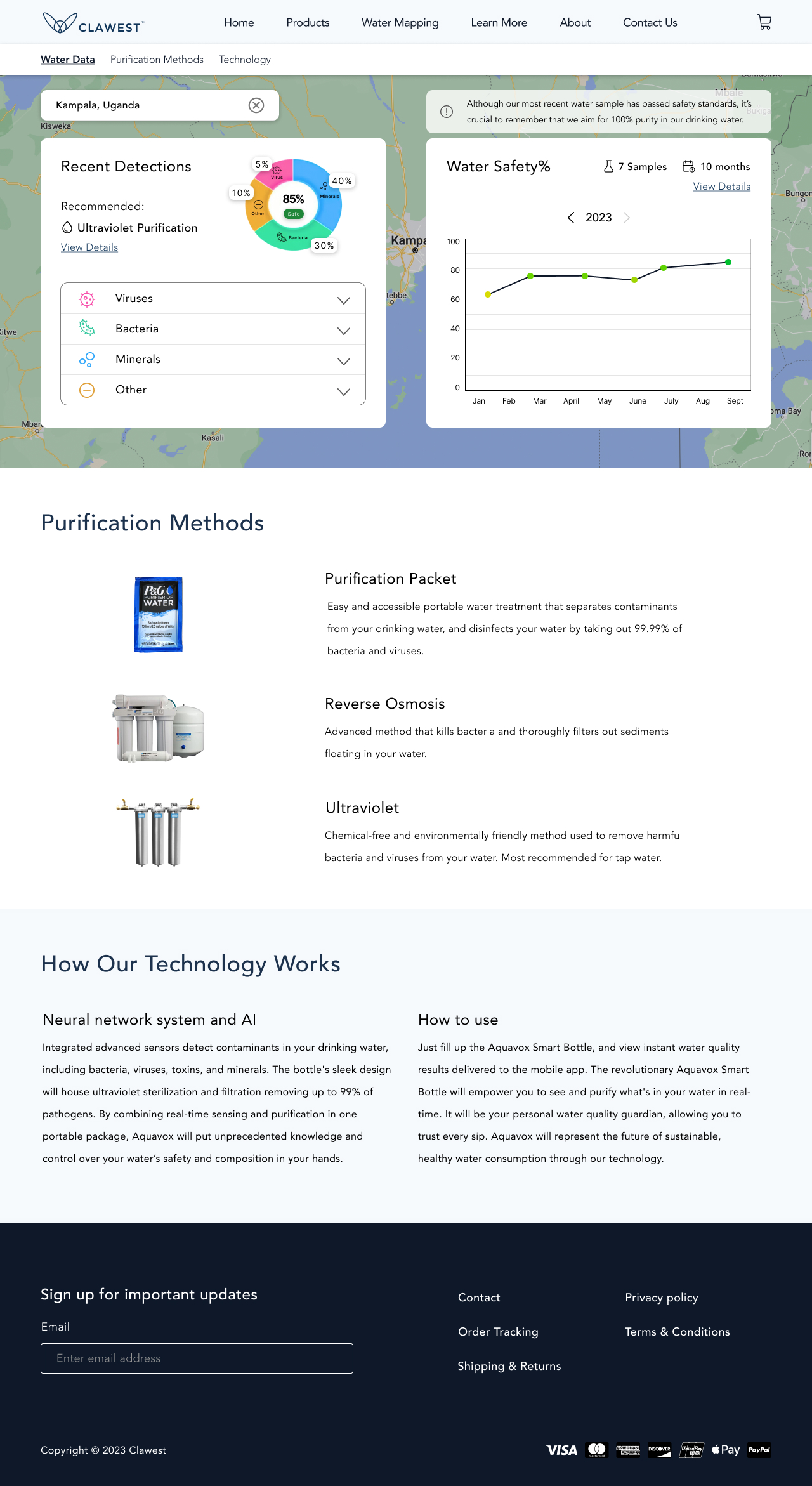
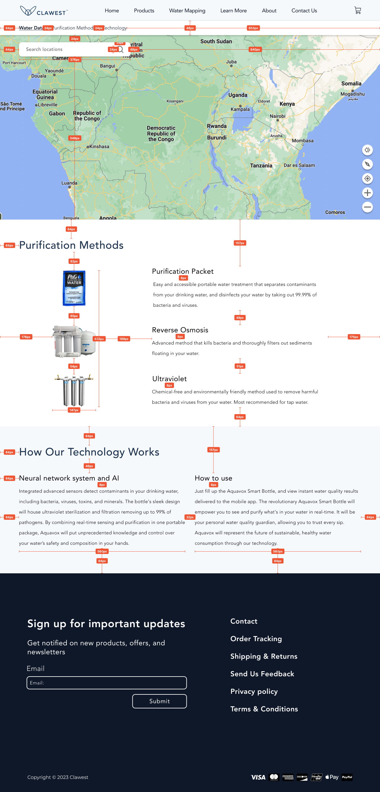
I helped design a water mapping page that pairs water-quality data with location. It was more complex than the other pages, so I studied Google Maps and MapQuest. Google’s patterns were the most familiar, so I built a system that used that model with Clawest’s water-quality visuals.
Final Style Guide
We created a final style guide and component library to keep track of all colors, icons, typography, and components used within the site. This not only helped us make quick changes to master components but will also serve as a helpful library for future work to be done on this site.
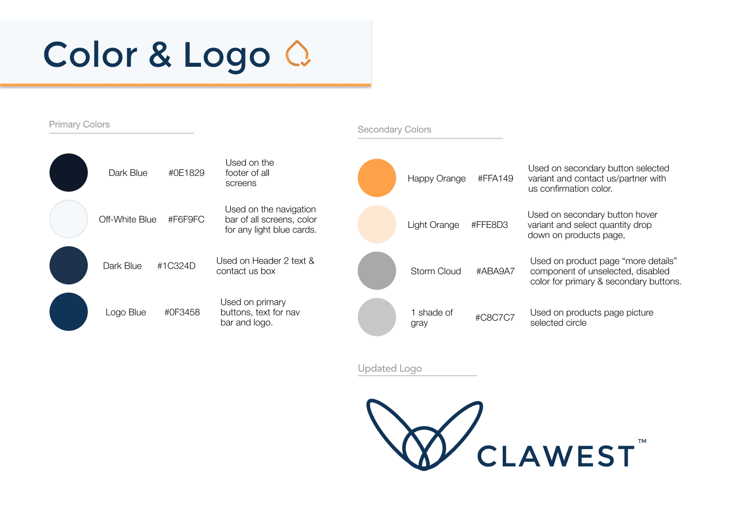
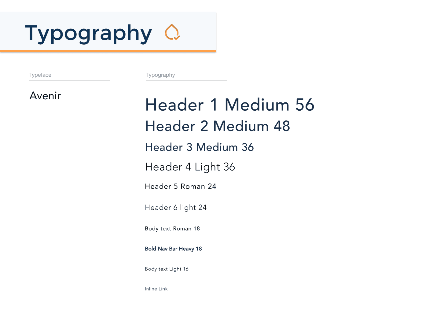
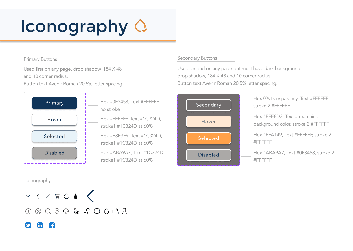
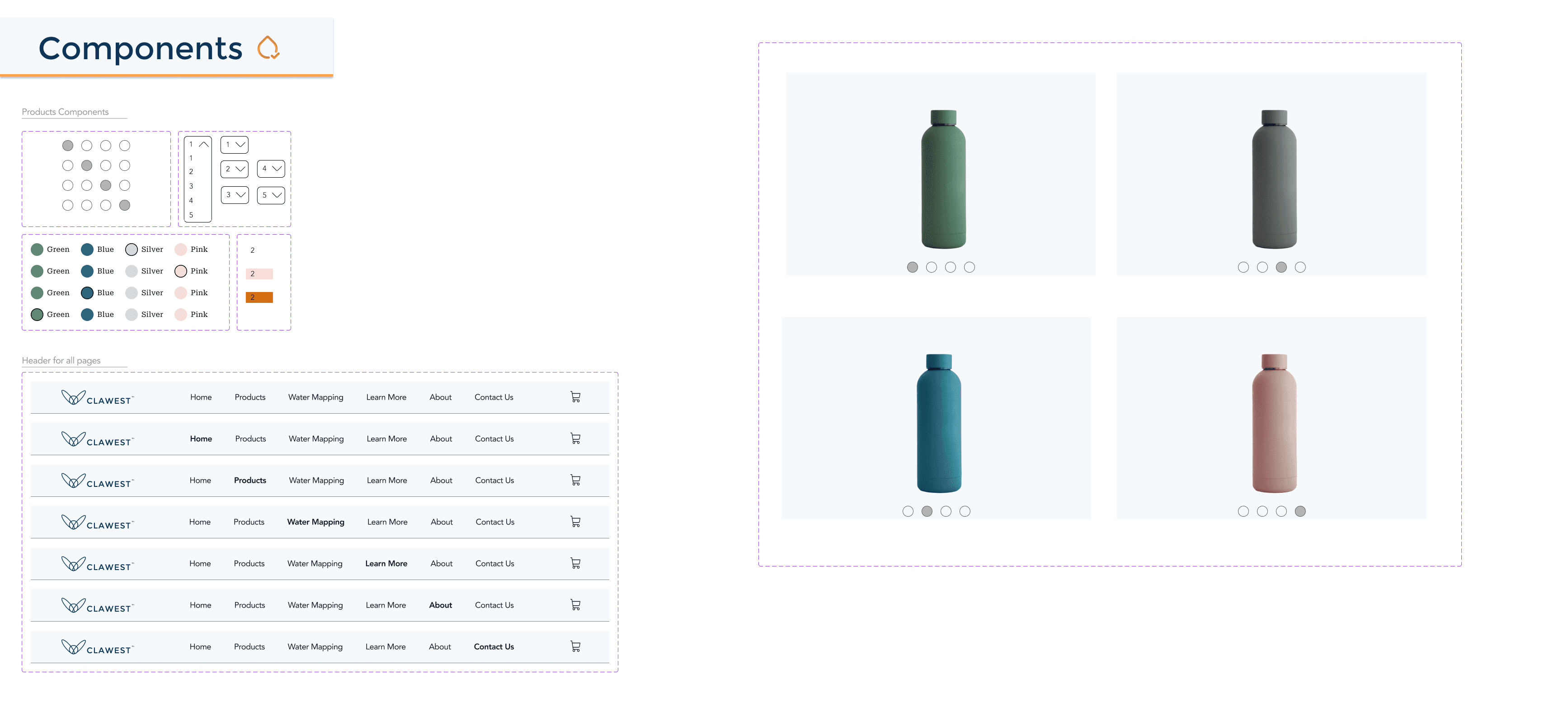
Color & logo
Step 4 of 5
Dev Handoff
Redlines & Breakpoints
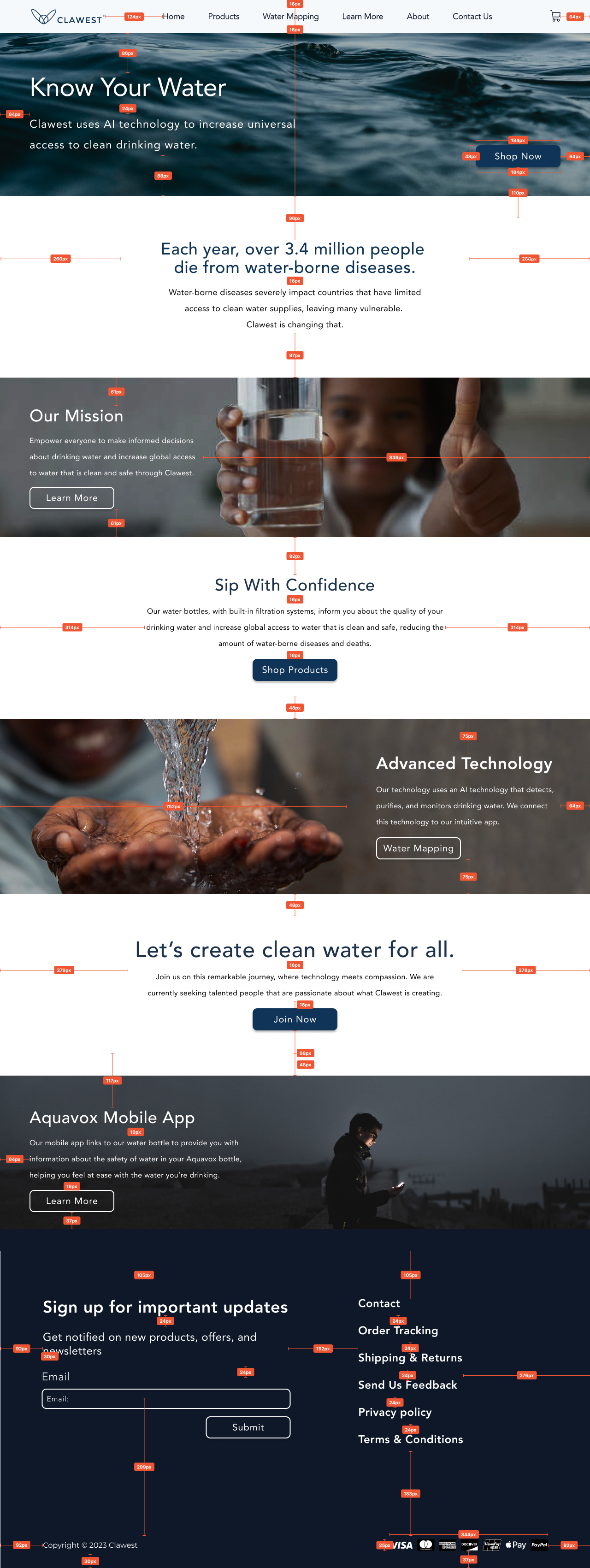
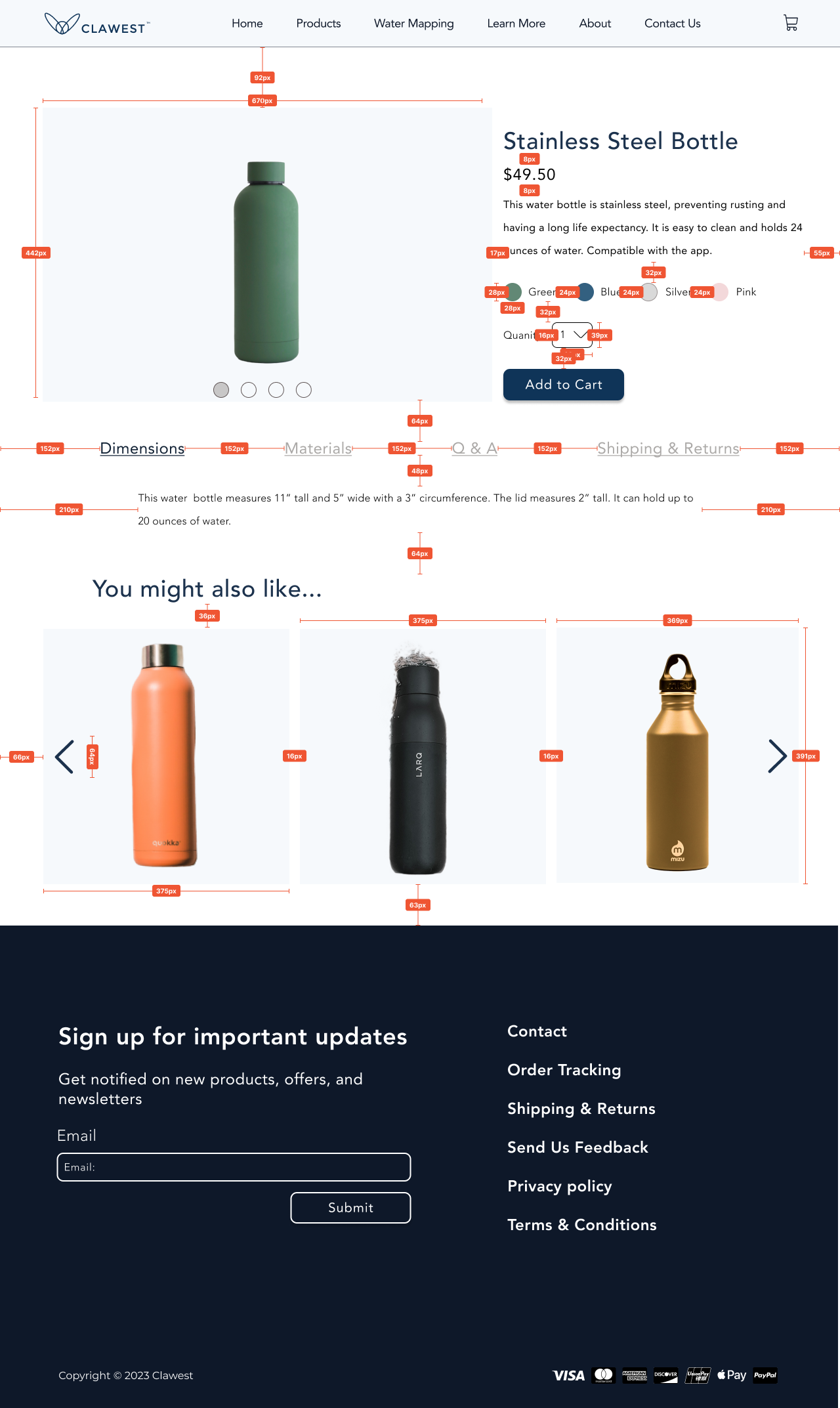
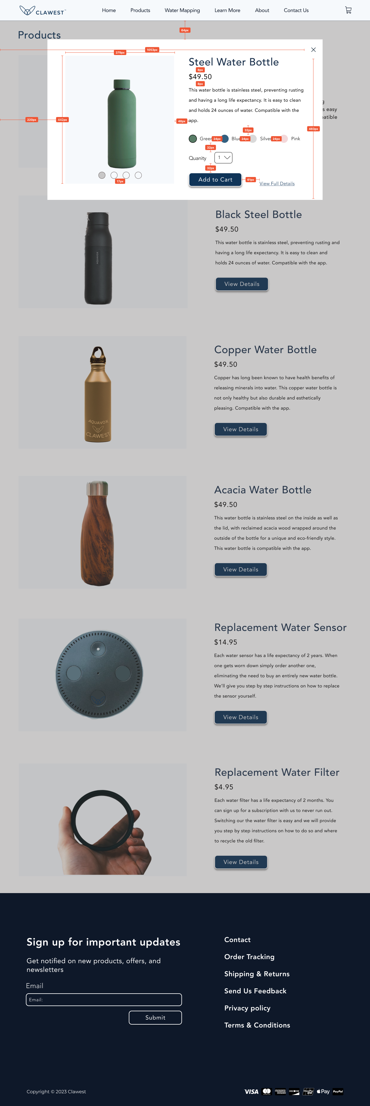
Once the client approved our final designs, we documented all measurements and navigation for the developer handoff to ensure accurate implementation. Every team member reviewed the developer report to confirm it matched our designs. I also created instructions for breakpoints to show how the design should adapt to different screen sizes, preventing issues like cut-off information and warped images.
Step 5 of 5
Reflection
What I Learned
Clawest taught me how to translate a founder's vision into a usable, on-brand experience while collaborating closely across a team of five. I strengthened my skills in research synthesis, data visualization for the water mapping page, and preparing thorough developer handoffs — and I learned to embrace feedback when my bolder concept gave way to the stronger, more consistent direction.