Case Study
Red 6
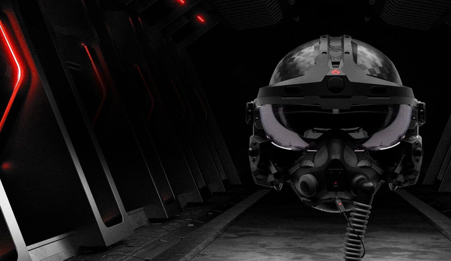
Six months designing the interfaces and debrief tools around Red 6's augmented-reality training — where pilots fly against synthetic adversaries in the real sky.
In 2024 I spent six months on-site in Orlando as a UX/UI Designer at Red 6, an augmented-reality company whose public mission is to let fighter pilots train against synthetic adversaries in the real sky. My work was the human side of that system: how pilots and instructors prepare for a sortie, fly with an AR head-mounted display, and make sense of it afterward in debrief.
Everything below is drawn from Red 6's public materials and my own role on the team. Because the work is covered by an NDA, this write-up focuses on the problem, my process, and how I collaborated — not the actual product interfaces I designed. No screenshots, wireframes, or internal tools are shown; the images here are public Red 6 marketing stills.
The Problem
Live adversary training is expensive and hard to scale, and traditional simulators can't reproduce real G-forces, weather, or the full workload of an actual cockpit. Red 6 puts synthetic threats into a pilot's real field of view — but that only helps if the interfaces around it stay legible to a fighter pilot flying under high G, in daylight, with no room for desktop-style menus.
The Solution
I focused on user-centered design for the interfaces surrounding the AR hardware and for the tools instructors use to plan and debrief. Grounded in interviews with fighter pilots and close, day-to-day work with engineers building in Unreal Engine, the aim was interfaces that feel obvious in the cockpit and genuinely useful back on the ground.
- Tools
- Figma
- Illustrator
- Unreal Engine
- Process
- Discovery
- Ideation
- Design
- Dev Handoff
- Reflection
- My Role
- UX/UI Designer
- Pilot interviews
- On-site, Orlando
- Timeline
- 6 months (2024)
Step 1 of 5
Discovery
Meeting the Mission
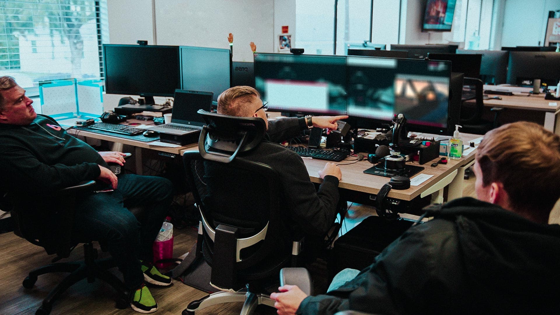
I joined a cross-functional team of designers, engineers, and people with real military-aviation backgrounds. My first job was to understand what Red 6 builds — outdoor, in-flight augmented reality that lets pilots see synthetic aircraft in their real environment — and to find where a designer fits into a product that spans hardware, a real-time engine, and a live cockpit.
Design didn't happen in isolation. I sat close to engineering and to former pilots, and shared work early and often with founders and product managers so decisions stayed grounded in how the system is actually flown.
Pilots as the Source of Truth
The users here aren't desktop users — they're fighter pilots. I ran interviews with pilots to learn how they actually work a sortie, what they need to see in the moment, and what earns their trust. Those conversations became the reference I checked every design decision against. The questions I kept coming back to:
- What information matters in the air, and what is just noise under workload?
- When does a pilot glance at an interface, and how little time do they have to read it?
- What has to be true for a pilot to trust what the system is showing them?
- How do instructors want to reconstruct a flight once everyone is back on the ground?
Designing for the Real Sky
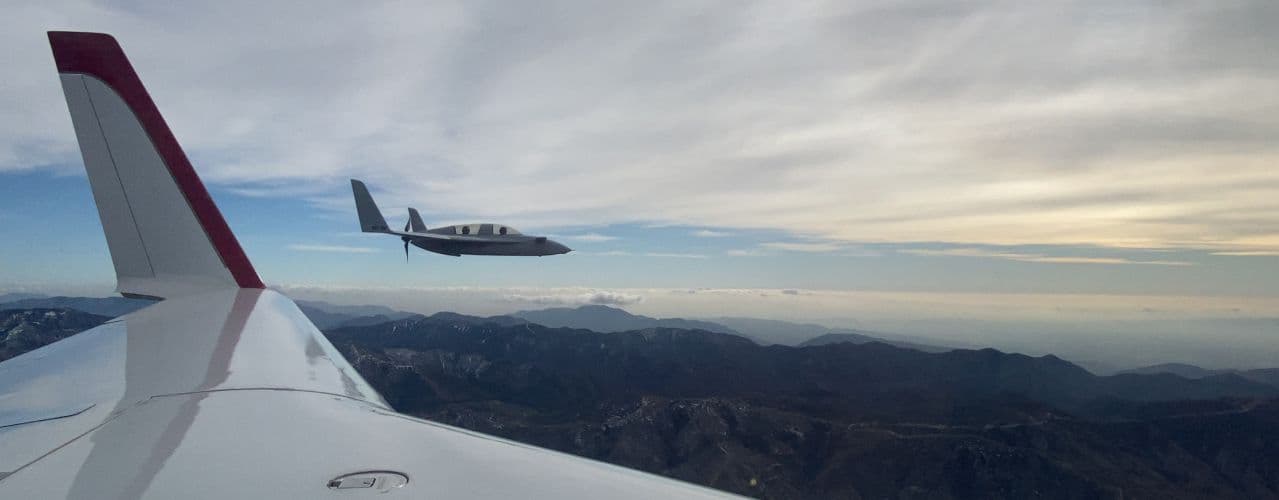
Red 6's core idea — publicly, its ATARS platform — is that training happens in a real aircraft, outdoors, in daylight. That environment sets hard constraints that a normal screen never faces: bright sun, a wide field of view, latency that has to disappear, and a pilot pulling G. Discovery was as much about internalizing those limits as it was about features.
Step 2 of 5
Ideation
Live Flight, Overlay, Debrief
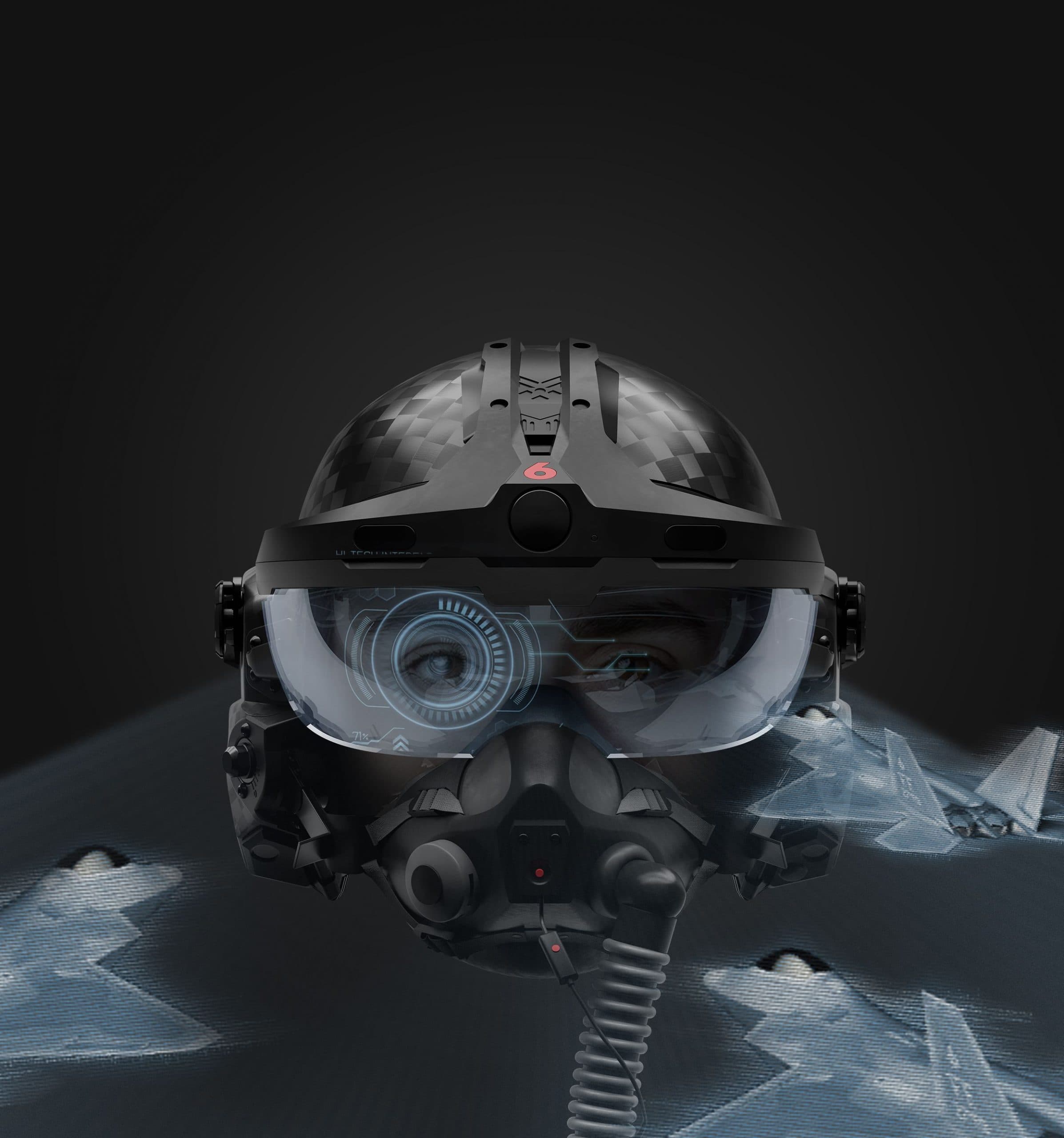
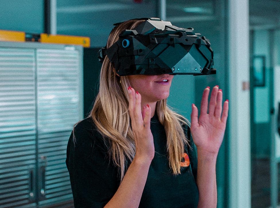
The experience really has three connected moments: planning a sortie, flying it with an AR overlay in the aircraft, and debriefing it afterward. I sketched how those moments hand off to one another, and where a pilot's attention lives in each — thinking in spatial, heads-up terms rather than flat 2D panels.
Concepting in Figma & Unreal
I explored interface concepts in Figma and Illustrator, then worked alongside engineers to see them in context inside Unreal Engine, where the spatial and real-time behavior actually lives. Iterating between a flat design tool and a 3D engine kept the ideas honest — an overlay that looks clean on a canvas has to survive motion, depth, and a real background. (The concepts themselves stay under NDA.)
Step 3 of 5
Design
Interfaces for a Head-Mounted Display
Designing for a head-mounted display in a cockpit rewrites the usual rules. Everything has to be glanceable and high-contrast against a bright sky, readable under G, and free of the menus, hover states, and dense chrome a desktop app leans on. I concentrated on patterns that a pilot can parse in a fraction of a second and then look straight past.
Tools for the Debrief
A sortie only teaches something if it can be replayed and discussed. I worked on the interfaces instructors use to reconstruct a flight and walk a pilot through it — designed so the story of the training is clear without exposing any of the real product screens. The design challenge was turning a rich, three-dimensional event into something an instructor can drive quickly in front of a room.
Step 4 of 5
Dev Handoff
Handing Off to Engineering
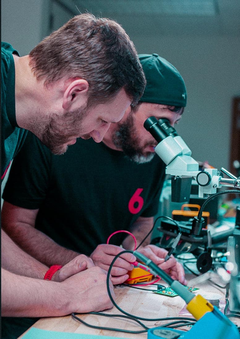
Handoff looks different when the surface isn't a website but a headset and a real-time engine. Instead of redlining static pages, I worked directly with the Unreal and hardware teams to specify states, behaviors, and how an interface should react to motion and context. Being on-site meant I could answer questions at the bench and adjust as the hardware and engine imposed their own realities.
Step 5 of 5
Reflection
What I Took Away
Red 6 taught me to design for users I could never out-expert — fighter pilots — and to treat their experience as the specification. I learned to design inside genuine hardware limits, to move fluidly between Figma and Unreal Engine, and to collaborate with engineers and former aircrew as equals. Most of all, it recalibrated my bar for what “simple” means: if it isn’t obvious at a glance, under pressure, it isn’t simple enough.